
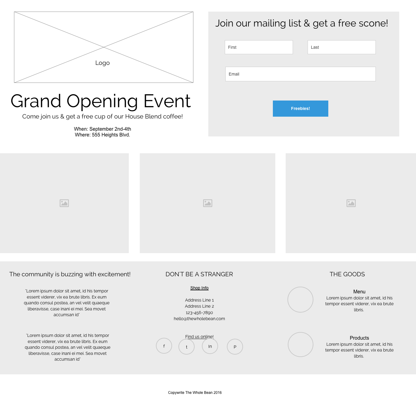
WIREFRAME WITH UXPIN
After sketching out my wireframe on paper, I use UXPin to get things up on the screen easily and start making adjustments to the layout.
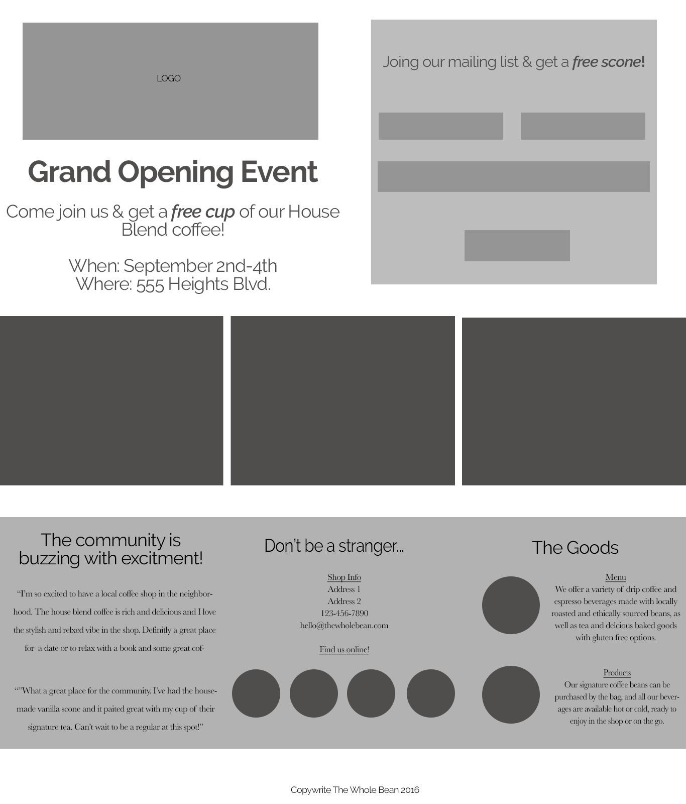
WIREFRAME WITH PHOTOSHOP
I used a 12 column layout which worked well to balance my 2 column section on top and 3 column section at the bottom.
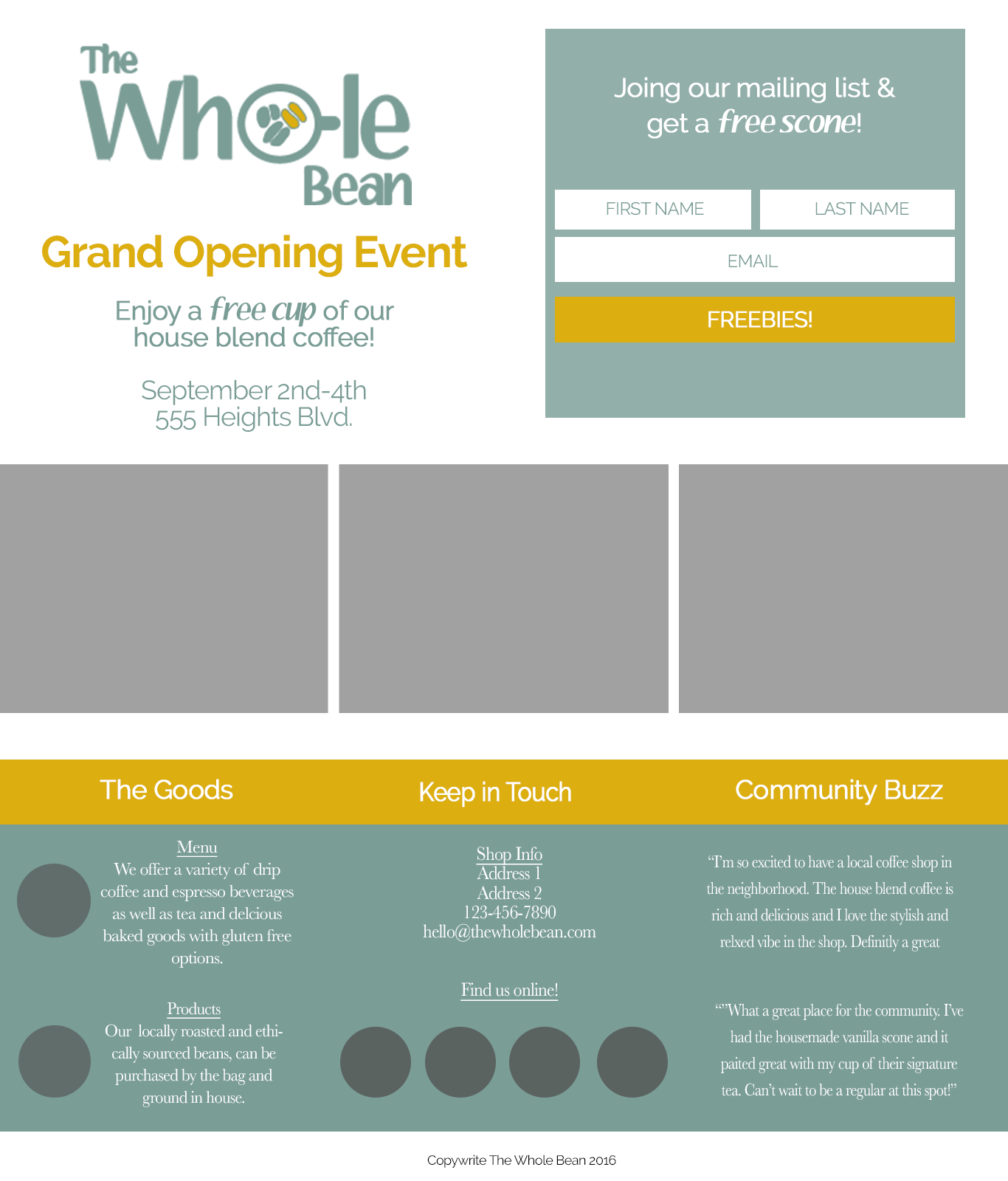
BEGIN APPLYING COLOR SCHEME AND FONTS
I moved the menu and products information to the left-hand side in order to balance out the icons and text across the bottom section.

ADD IMAGERY, ICONS, CTA AND ITERATE AFTER FEEDBACK
I decided to try a simple version with more white space and also changed the logo font to something that went with the modern color scheme and better reflected my brand personality.

FINAL DESIGN AFTER ADJUSTMENTS TO FONT, COPY AND ICONS.
After getting feedback I decided on the design with the colored section at the bottom to divided up the information and make the site goals and main user actions top of mind.